
Sometimes I find myself looking back at old work I haven't laid my eyes on for a while. When we moved into our house and placed all of our art storage items and materials in the studio, I found some pieces I had forgotten about. Looking at my own artwork critically allows me to rediscover themes that have interested me in the past and that still hold importance for one reason or another.
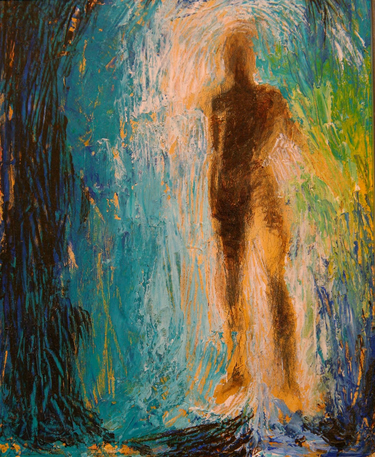
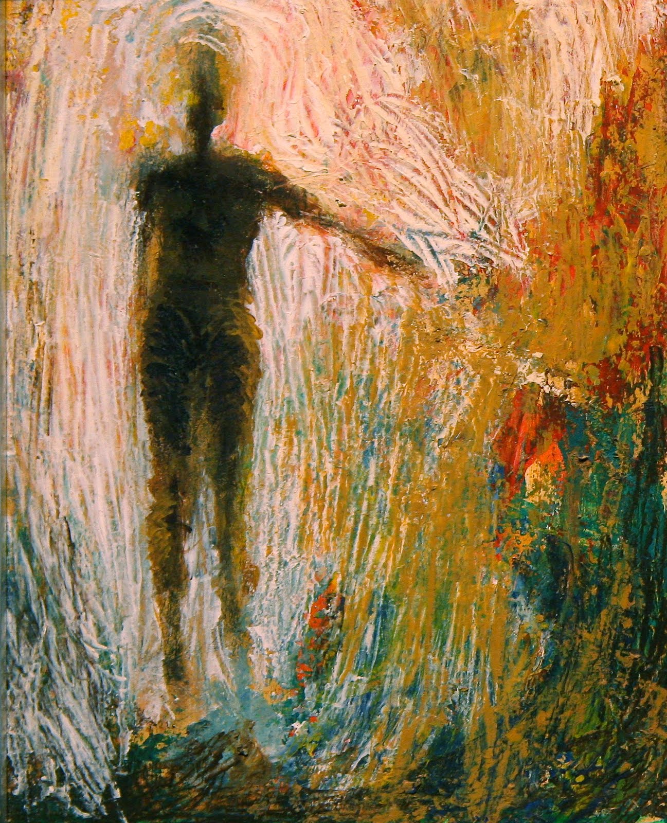
I found myself studying the surfaces of some of the paintings and becoming re-inspired to utilize the techniques in my new work. For some reason I seem to eventually migrate in a painting to creating texture in the material itself. I like my images to contain an organic quality if I can succeed in producing it. I would like the painting to feel as though it naturally emerged out of the surface through some natural process outside of my control, as if lichen and earth had materialized on their own and self-organized into an image.
These are some figurative paintings that are tiny acrylic studies on masonite. There's barely any brushwork involved, rather I applied the paint using a knife. I was exploring the idea of figures in a furnace. This sprang out of the Biblical account of Shadrach, Meshach and Abednego. The notions of a trial and miraculous survival, the proving of faith as well as the purification through fire were central.

Comments